Components Pro Access
85
of 350 Components in 2025 (24%)
Getting started:
01. Copy Component
02. Paste into project
Table view
Filters
Thank you! Your submission has been received!
Oops! Something went wrong while submitting the form.
Filters
Card 11
PRO
interaction

Card 12
PRO
interaction

Features 12
PRO
interaction

Team 6
PRO
interaction

Team 5
PRO
interaction

Team 4
PRO
interaction

Team 3
PRO
interaction

Team 2
PRO
interaction
Features 10
PRO
interaction

Features 15
PRO
interaction

Footer 2
PRO
interaction
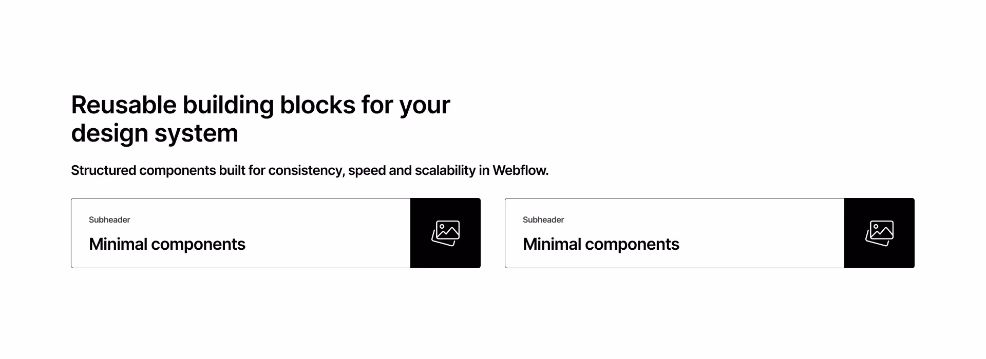
Hero 5
PRO
interaction

Testimonial
PRO
interaction

Footer 1
PRO
interaction

Accordion 1
PRO
interaction

Features 13
PRO
interaction

Features 14
PRO
interaction

Cta 5
PRO
interaction

Cta 4
PRO
interaction

Cta 3
PRO
interaction

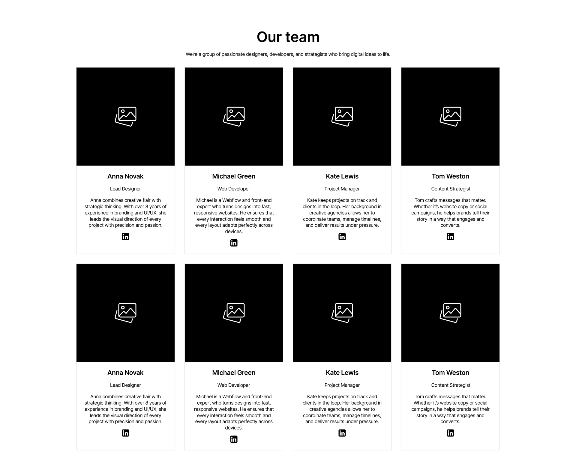
Team 1
PRO
interaction

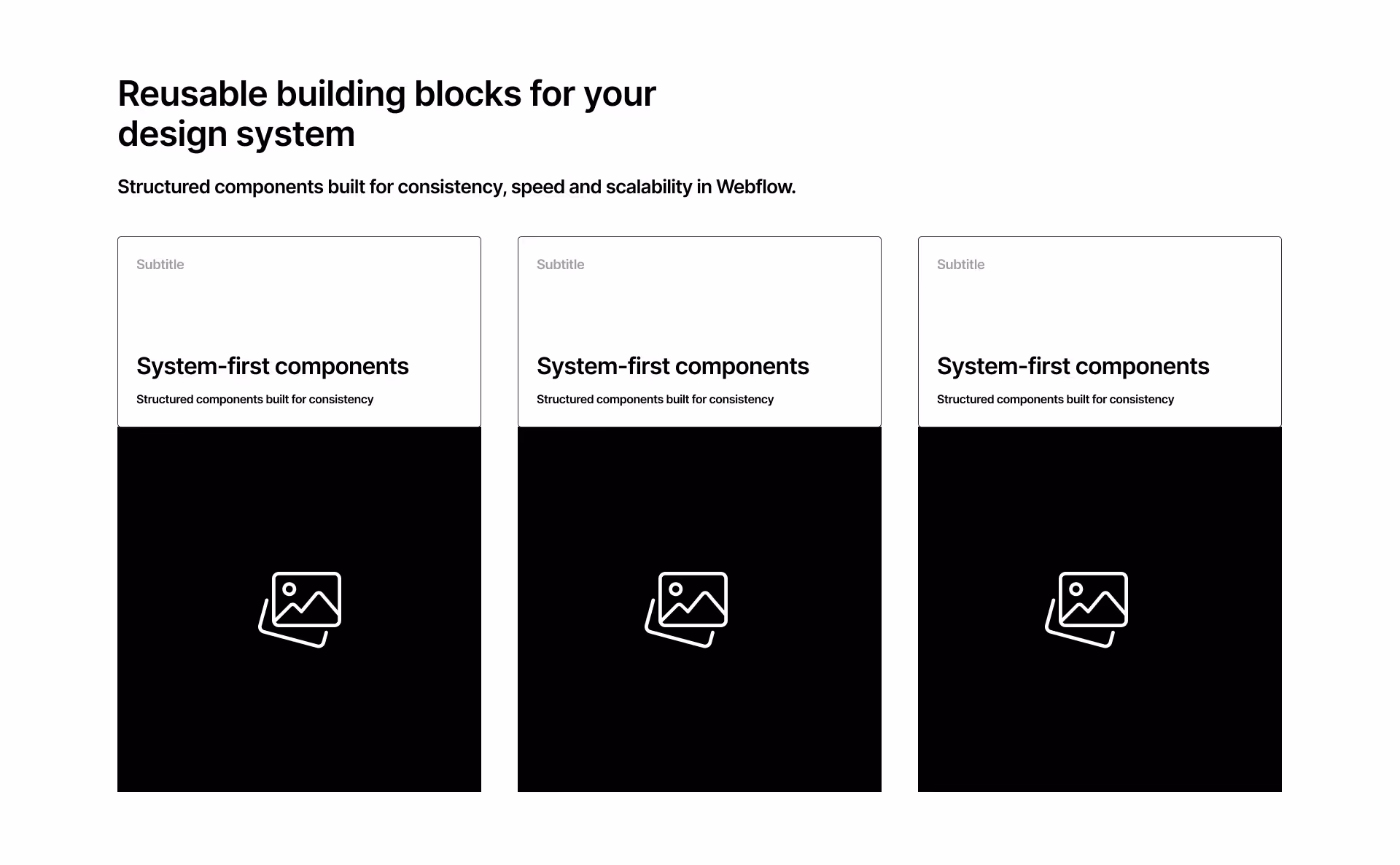
Features 1
PRO
interaction

Features 3
PRO
interaction

Features 8
PRO
interaction

Faq 3
PRO
interaction

Faq 2
PRO
interaction

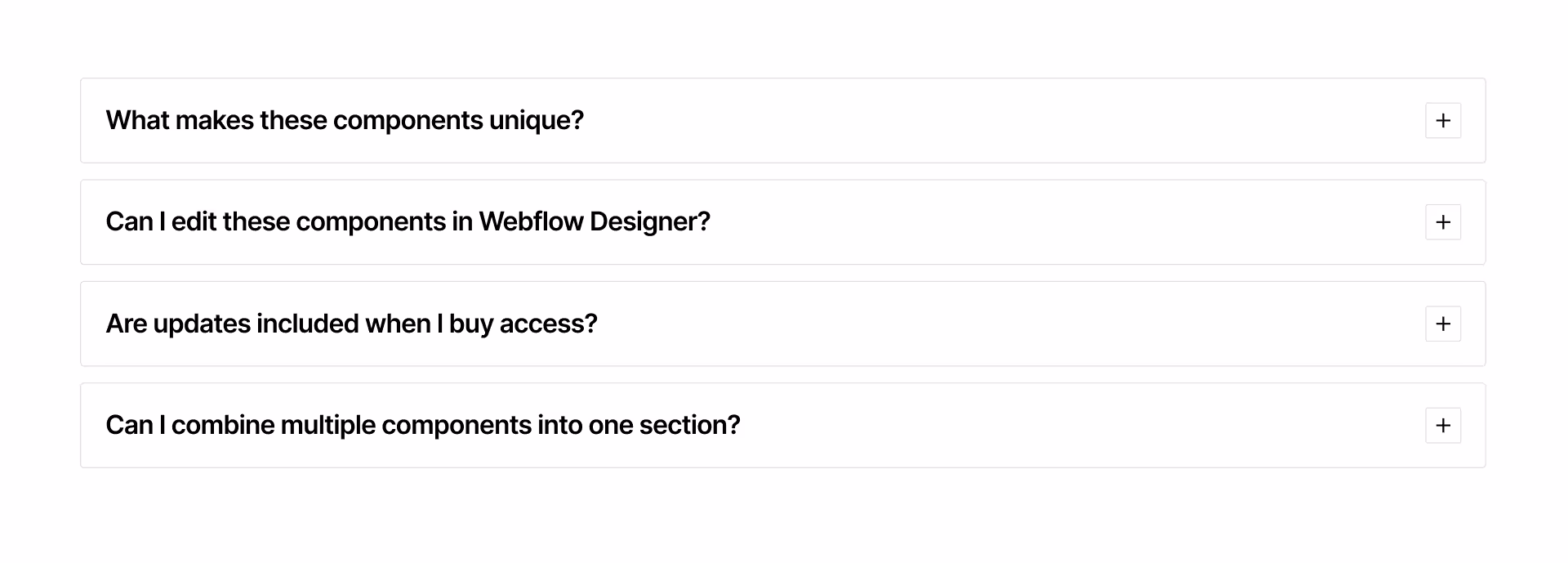
FAQ 1
PRO
interaction

Accordion 3
PRO
interaction