
Components Pro Access
85
of 350 Components in 2025 (24%)
Getting started:
01. Copy Component
02. Paste into project
Table view
Filters
Thank you! Your submission has been received!
Oops! Something went wrong while submitting the form.
Filters
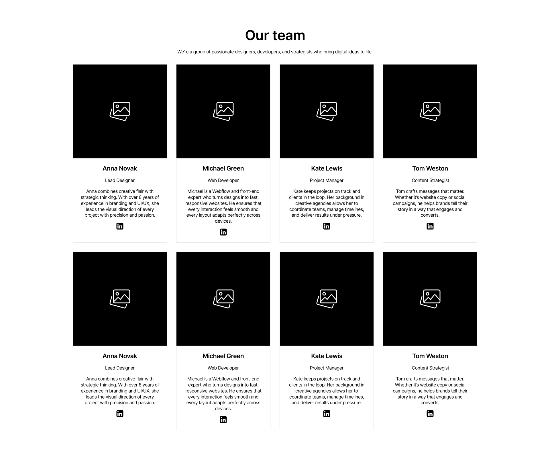
Team 5
PRO
interaction

Team 4
PRO
interaction

Team 3
PRO
interaction

Team 2
PRO
interaction
Card 12
PRO
interaction

Features 10
PRO
interaction

Features 15
PRO
interaction

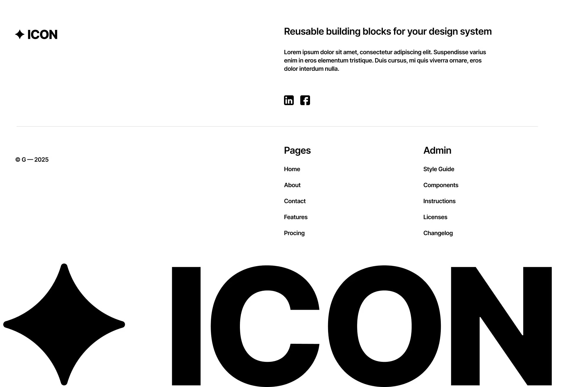
Footer 2
PRO
interaction
Hero 5
PRO
interaction

Testimonial
PRO
interaction

Footer 1
PRO
interaction

Accordion 1
PRO
interaction

Features 13
PRO
interaction

Features 14
PRO
interaction

Cta 5
PRO
interaction

Cta 4
PRO
interaction

Cta 3
PRO
interaction

Team 1
PRO
interaction

Features 1
PRO
interaction

Features 3
PRO
interaction

Features 8
PRO
interaction

Features 12
PRO
interaction

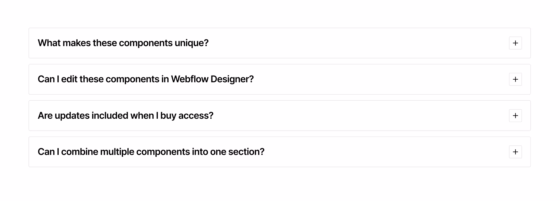
Faq 3
PRO
interaction

Faq 2
PRO
interaction

FAQ 1
PRO
interaction

Accordion 3
PRO
interaction

Accordion 2
PRO
interaction
Step 1
PRO
interaction
