Results 1
Showing items 1 to3 of 6
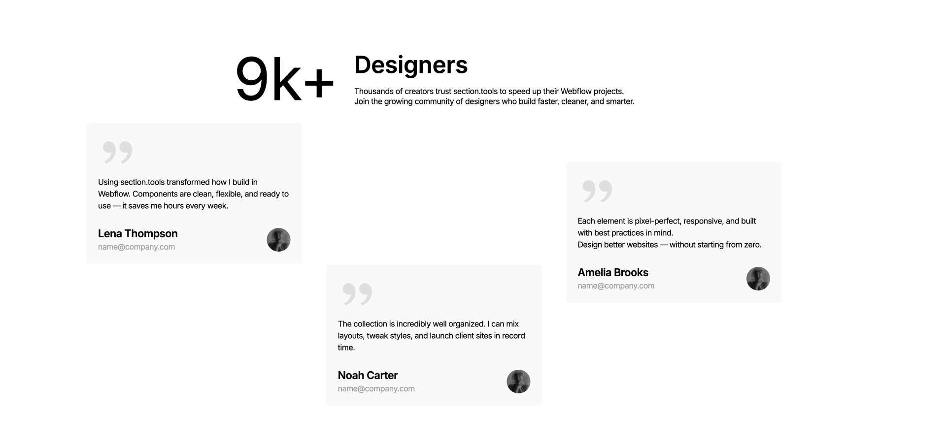
Testimonial
Component interaction
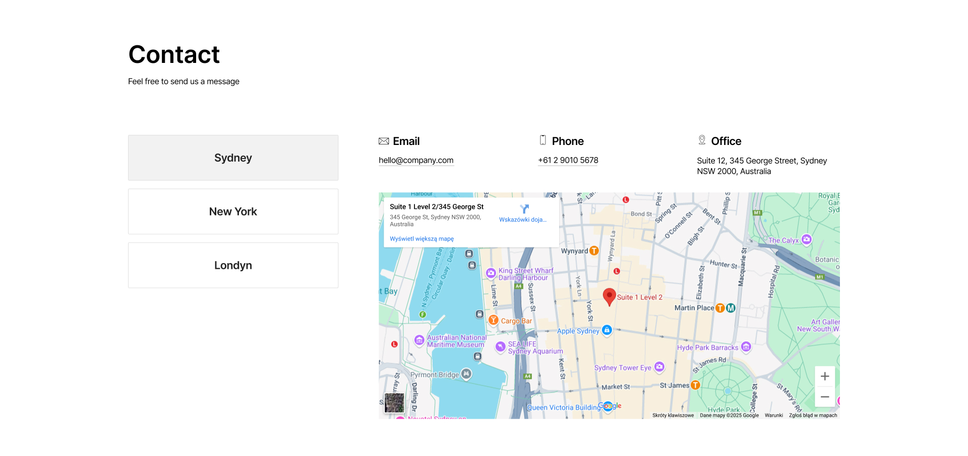
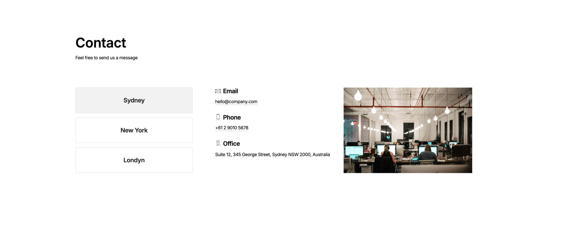
Contact
Component interaction
Features
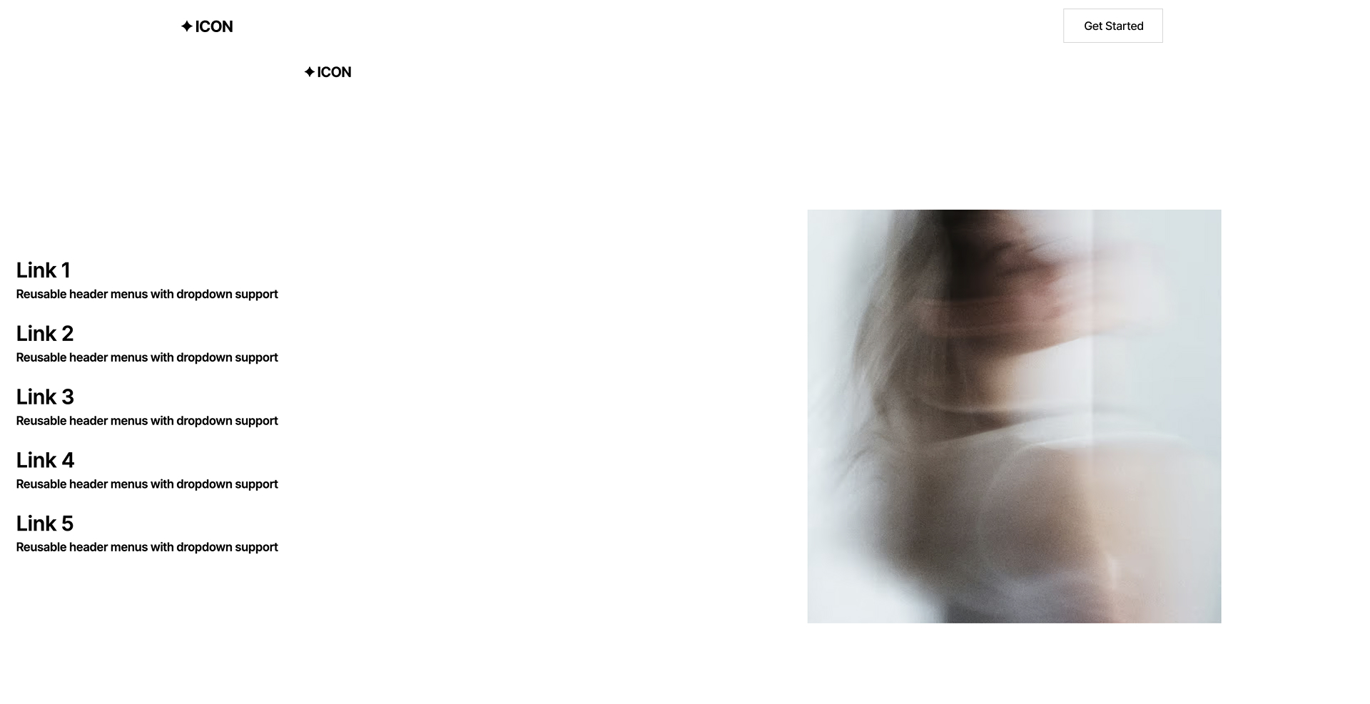
Component interaction
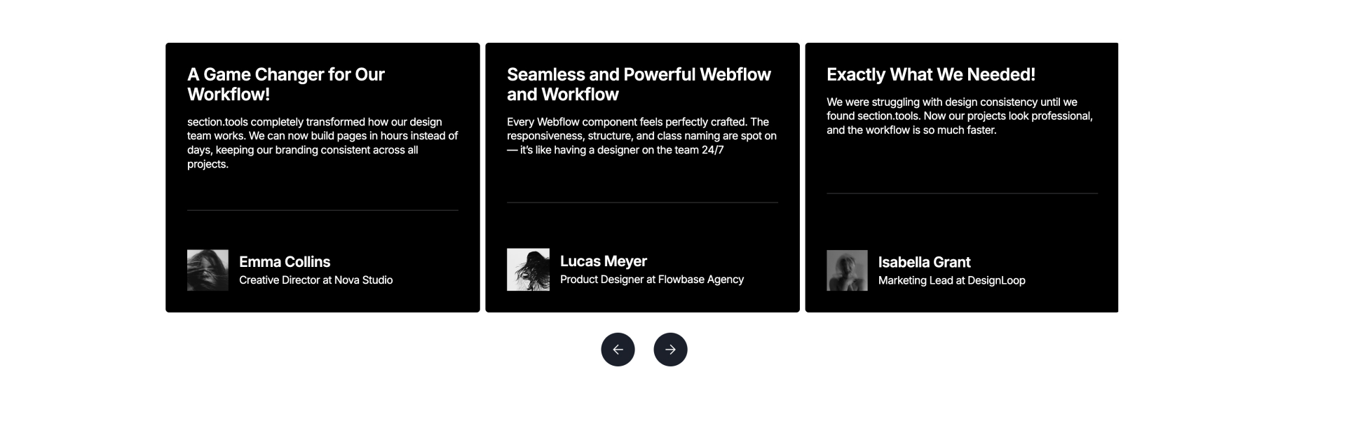
Testimonial
Component interaction
Contact
Component interaction
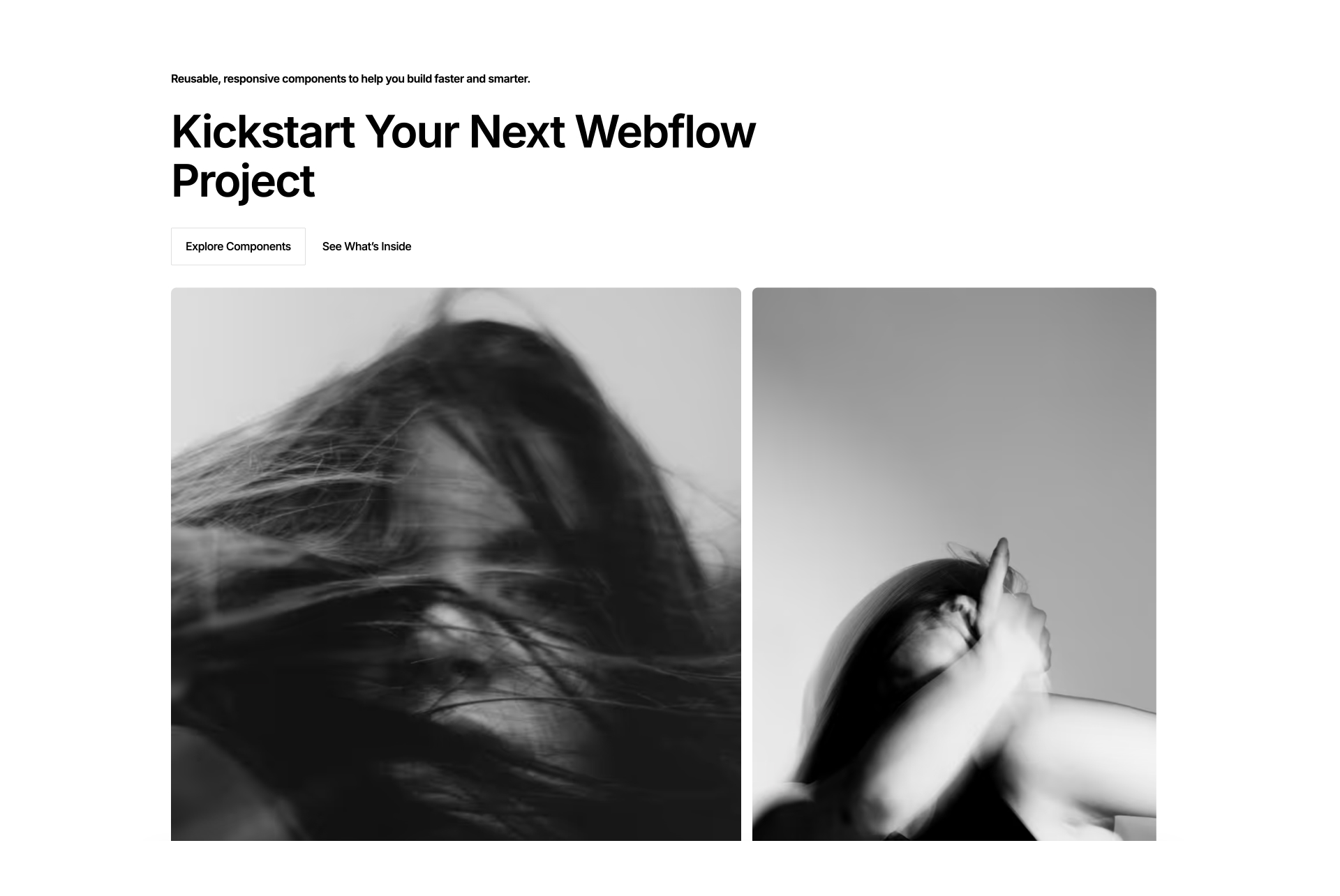
Features
Component interaction
Testimonial
Component interaction
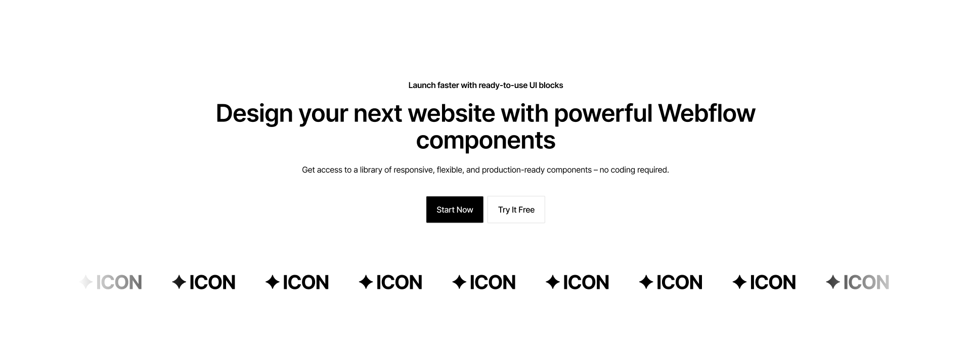
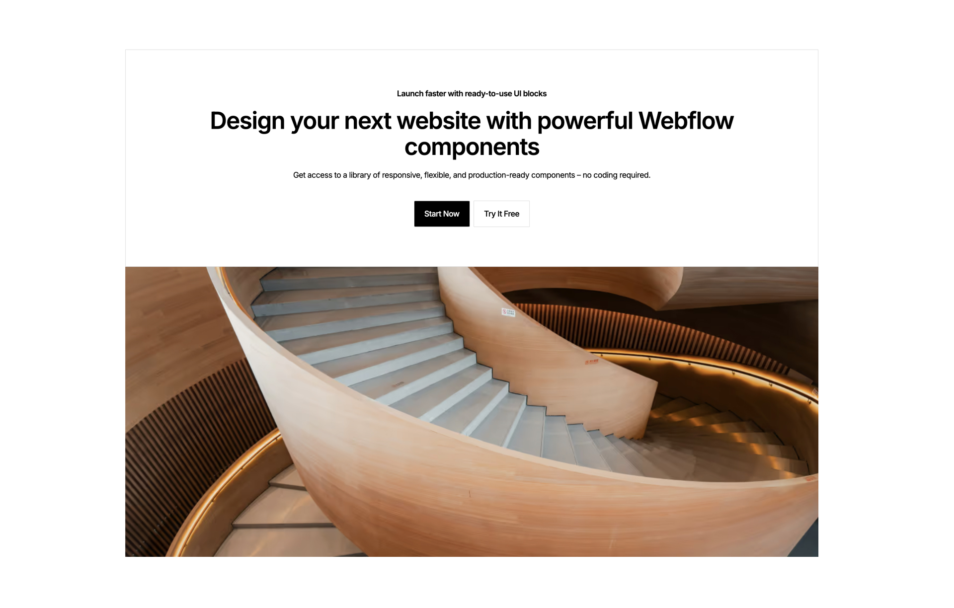
Hero
Component interaction
Contact
Component interaction
There are no available cars matching the current filters.
Reset All

