Free Webflow components
Pricing
Component Access
FAQ
Blog
Contact
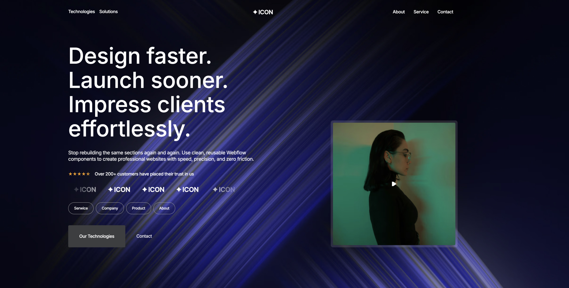
Build Webflow sites faster.Impress clients easier.
Lifetime access to high-converting UI sections that just work.
Buy Lifetime Access for 49$
Buy Lifetime Access for 49$
Clone Style Guide
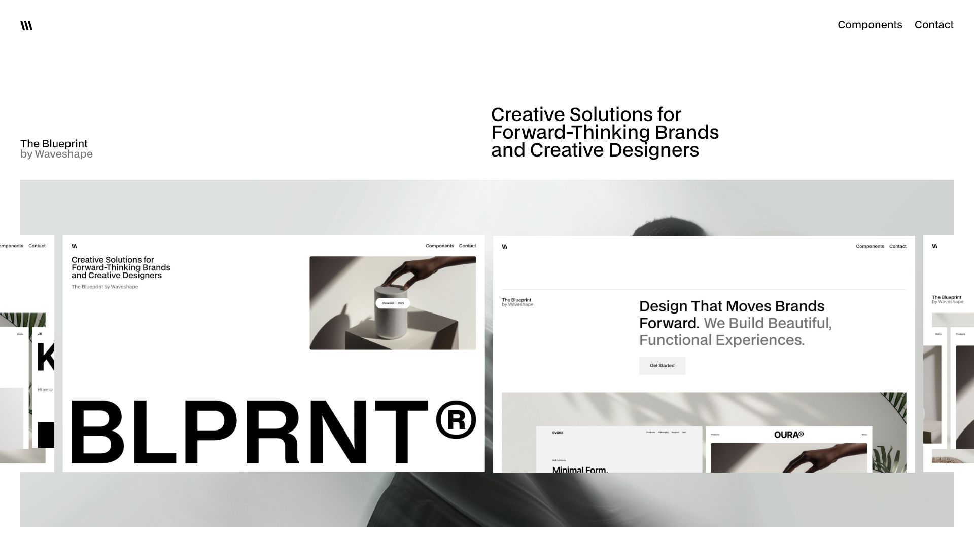
Showreel — 2025
Showreel — 2025
4 min
More Filters
Component interaction
Featured
Checkbox 8
Accordion
0
[
0
]
Banners
0
[
0
]
Blog
0
[
0
]
Card
0
[
0
]
Contact
0
[
0
]
Cta
0
[
0
]
Event
0
[
0
]
FAQ
0
[
0
]
Features
0
[
0
]
Footer
0
[
0
]
Header
0
[
0
]
Hero
0
[
0
]
List
0
[
0
]
Logo
0
[
0
]
Nav
0
[
0
]
Pricing
0
[
0
]
Step
0
[
0
]
Tabs
0
[
0
]
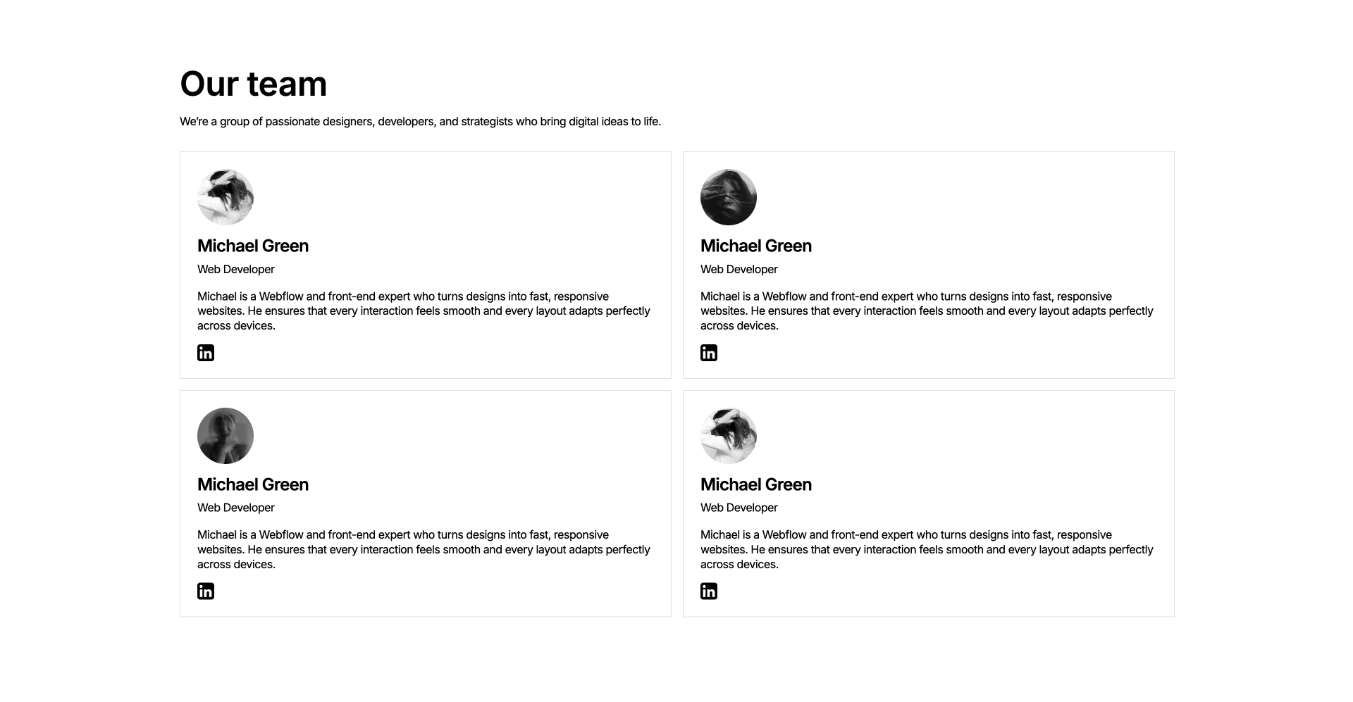
Team
0
[
0
]
Testimonial
0
[
0
]
Title
0
[
0
]
Clear All
Thank you! Your submission has been received!
Oops! Something went wrong while submitting the form.
Results
1
Showing items
1
to
3
of
6
Filtering by:
Tag
Operator
Value
Footer 20
interaction
COPY TO WEBFLOW
PREVIEW
Footer
Header 20
interaction
COPY TO WEBFLOW
PREVIEW
Header
Card 19
interaction
COPY TO WEBFLOW
PREVIEW
Card
Cta 19
interaction
COPY TO WEBFLOW
PREVIEW
Cta
Component interaction
Contact 19
interaction
COPY TO WEBFLOW
PREVIEW
Contact
Features 20
interaction
COPY TO WEBFLOW
PREVIEW
Features
Features 19
interaction
COPY TO WEBFLOW
PREVIEW
Features
Footer 19
interaction
COPY TO WEBFLOW
PREVIEW
Footer
Header 19
interaction
COPY TO WEBFLOW
PREVIEW
Header
Cta 18
interaction
COPY TO WEBFLOW
PREVIEW
Cta
Contact 18
interaction
COPY TO WEBFLOW
PREVIEW
Contact
Card 18
interaction
COPY TO WEBFLOW
PREVIEW
Card
Features 18
interaction
COPY TO WEBFLOW
PREVIEW
Features
Footer 18
interaction
COPY TO WEBFLOW
PREVIEW
Footer
Header 18
interaction
COPY TO WEBFLOW
PREVIEW
Header
Hero 17
interaction
COPY TO WEBFLOW
PREVIEW
Hero
Component interaction
Cta 17
interaction
COPY TO WEBFLOW
PREVIEW
Cta
Contact 17
interaction
COPY TO WEBFLOW
PREVIEW
Contact
Features 17
interaction
COPY TO WEBFLOW
PREVIEW
Features
Footer 17
interaction
COPY TO WEBFLOW
PREVIEW
Footer
Header 17
interaction
COPY TO WEBFLOW
PREVIEW
Header
Nav 17
interaction
COPY TO WEBFLOW
PREVIEW
Nav
Card 17
interaction
COPY TO WEBFLOW
PREVIEW
Card
Hero 16
interaction
COPY TO WEBFLOW
PREVIEW
Hero
Component interaction
Cta 16
interaction
COPY TO WEBFLOW
PREVIEW
Cta
Contact 16
interaction
COPY TO WEBFLOW
PREVIEW
Contact
Features 16
interaction
COPY TO WEBFLOW
PREVIEW
Features
Footer 16
interaction
COPY TO WEBFLOW
PREVIEW
Footer
Header 16
interaction
COPY TO WEBFLOW
PREVIEW
Header
Nav 16
interaction
COPY TO WEBFLOW
PREVIEW
Nav
Card 16
interaction
COPY TO WEBFLOW
PREVIEW
Card
Hero 15
interaction
COPY TO WEBFLOW
PREVIEW
Hero
Component interaction
Previous
1
...
Next
There are no available cars matching the current filters.
Reset All

