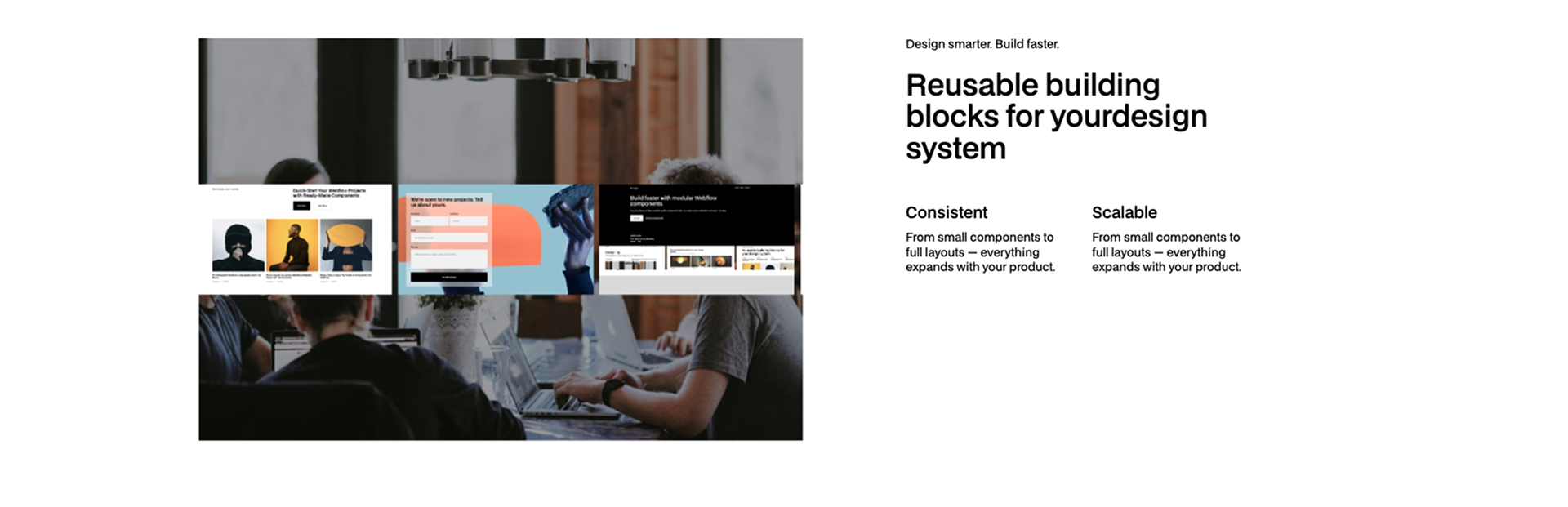
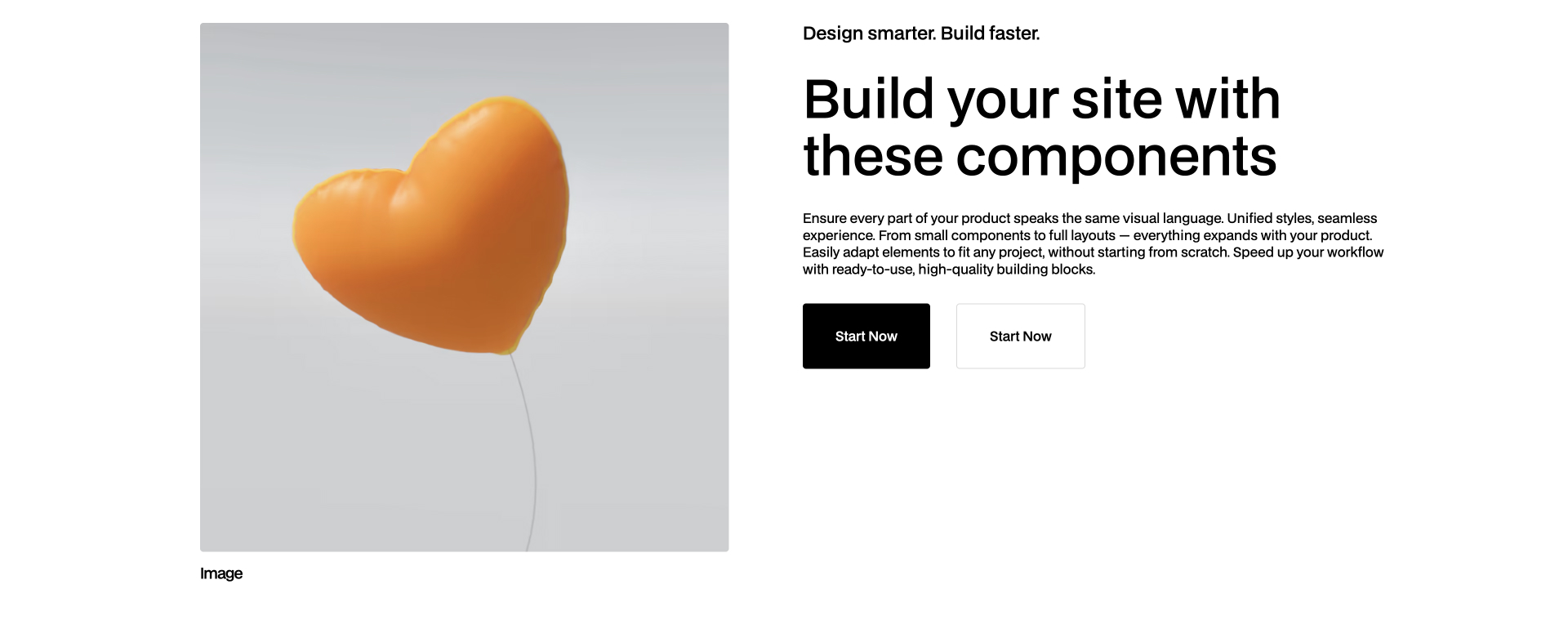
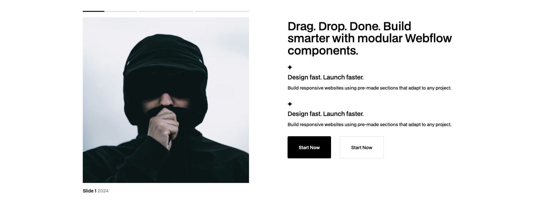
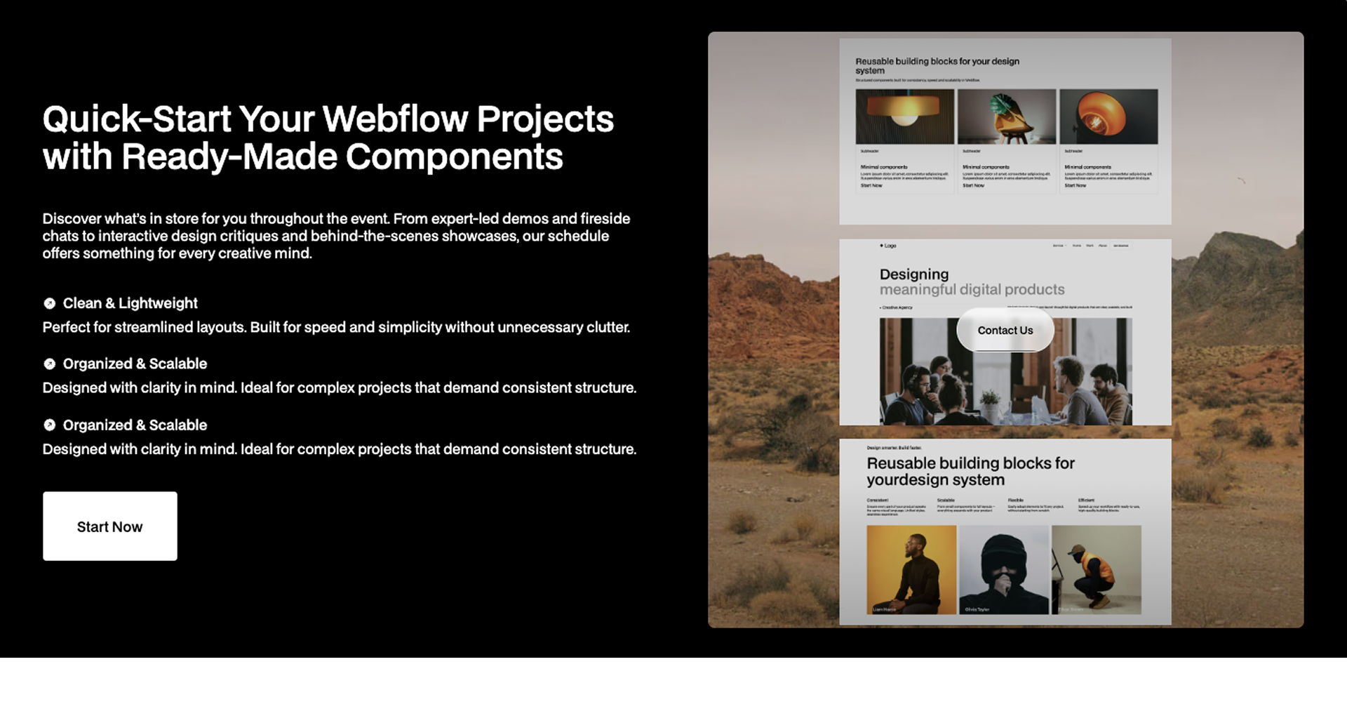
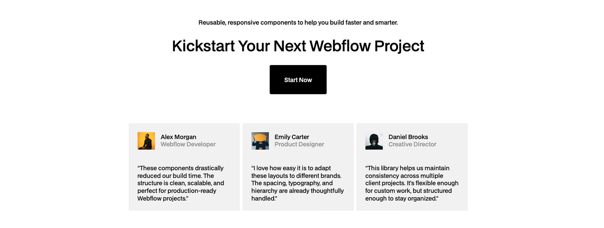
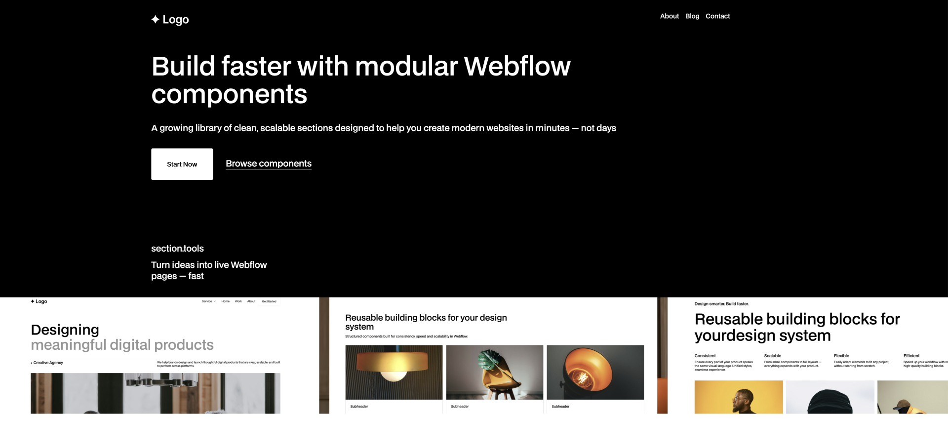
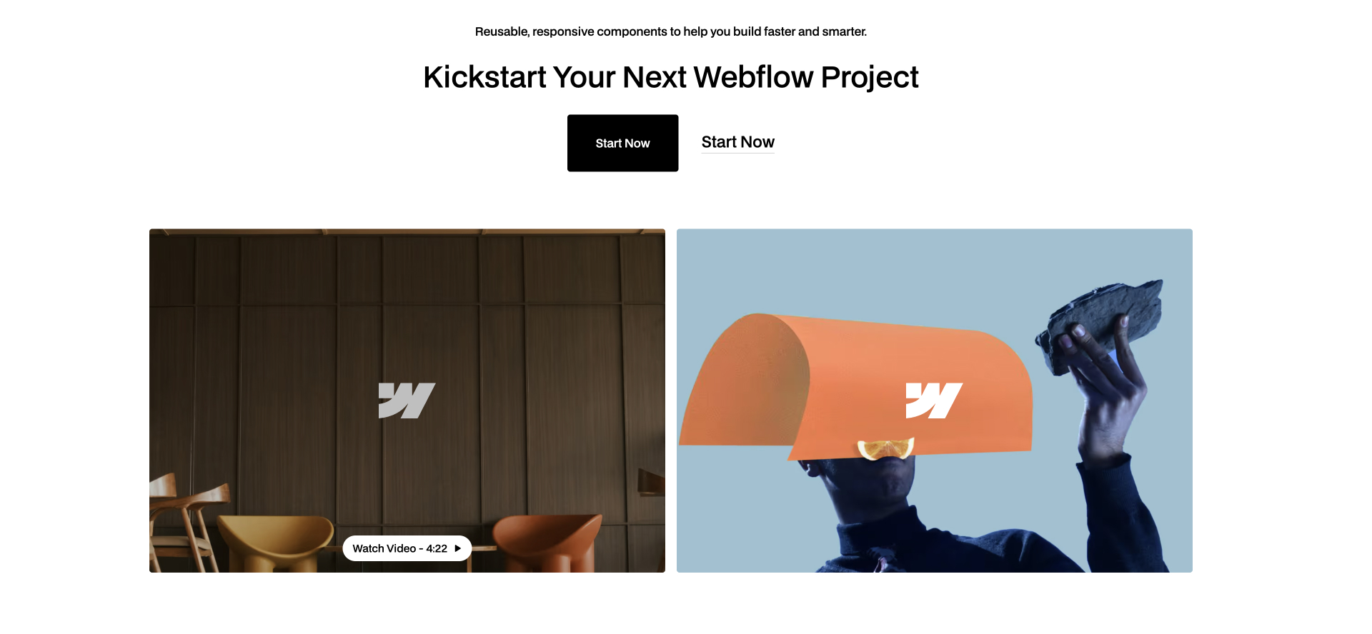
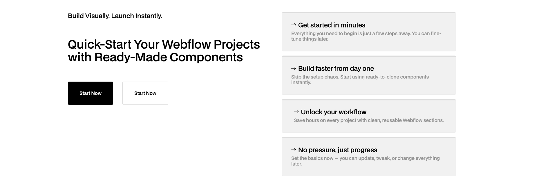
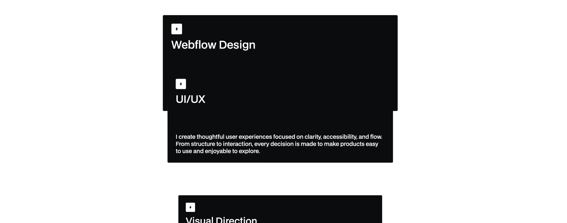
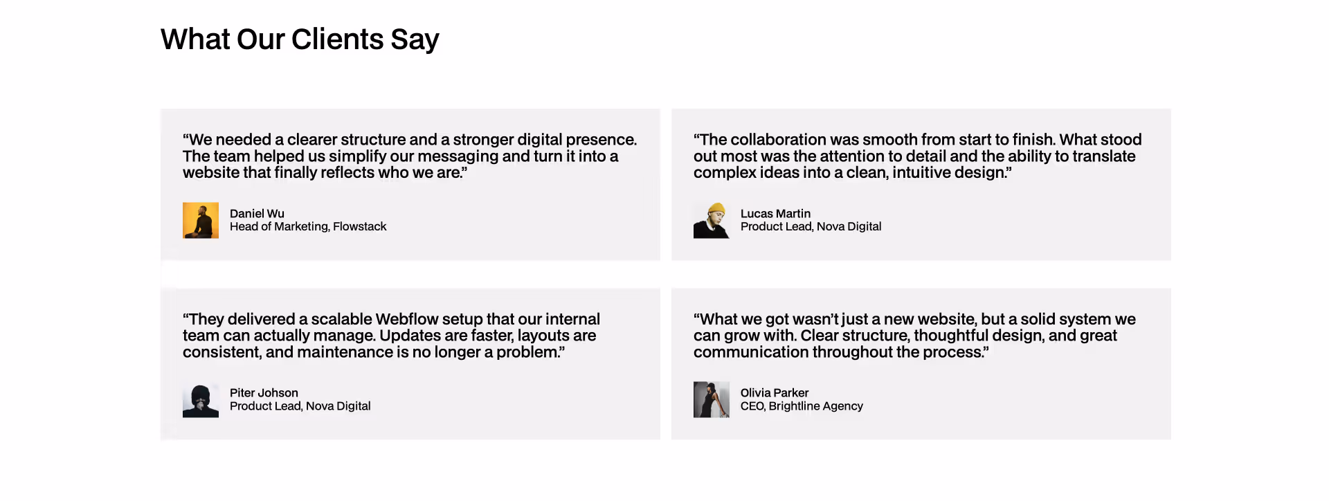
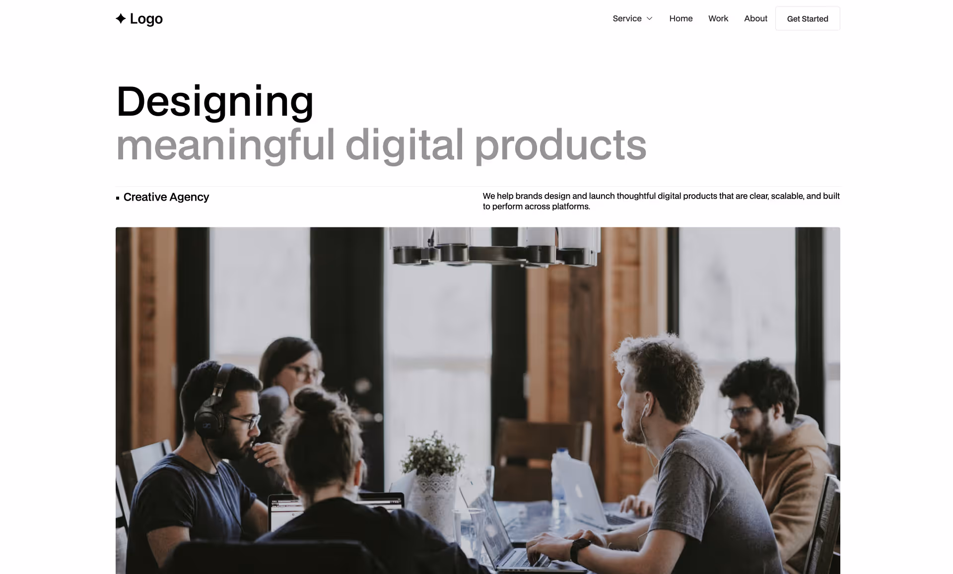
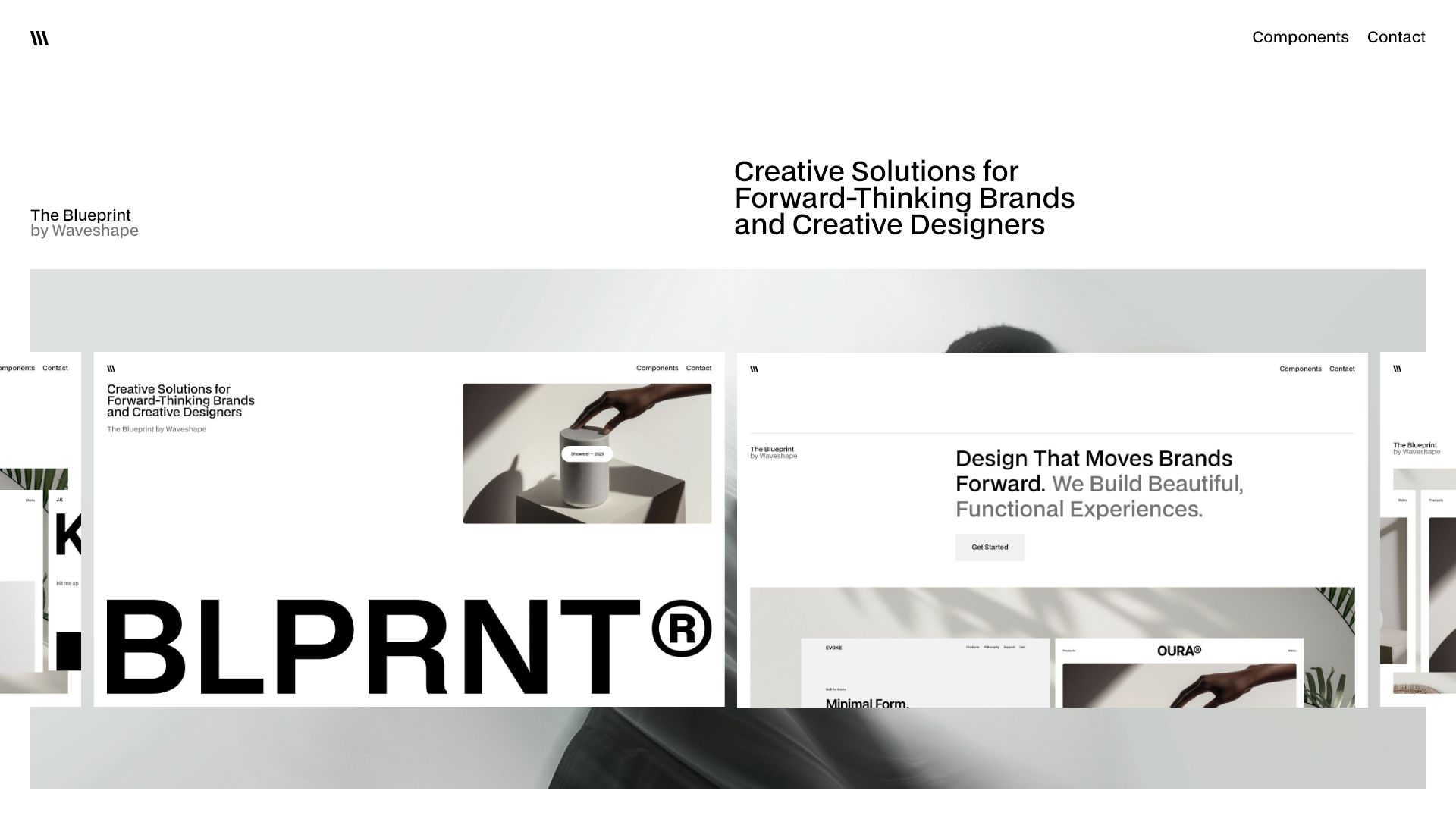
My Webflow Components Library for faster, consistent website builds
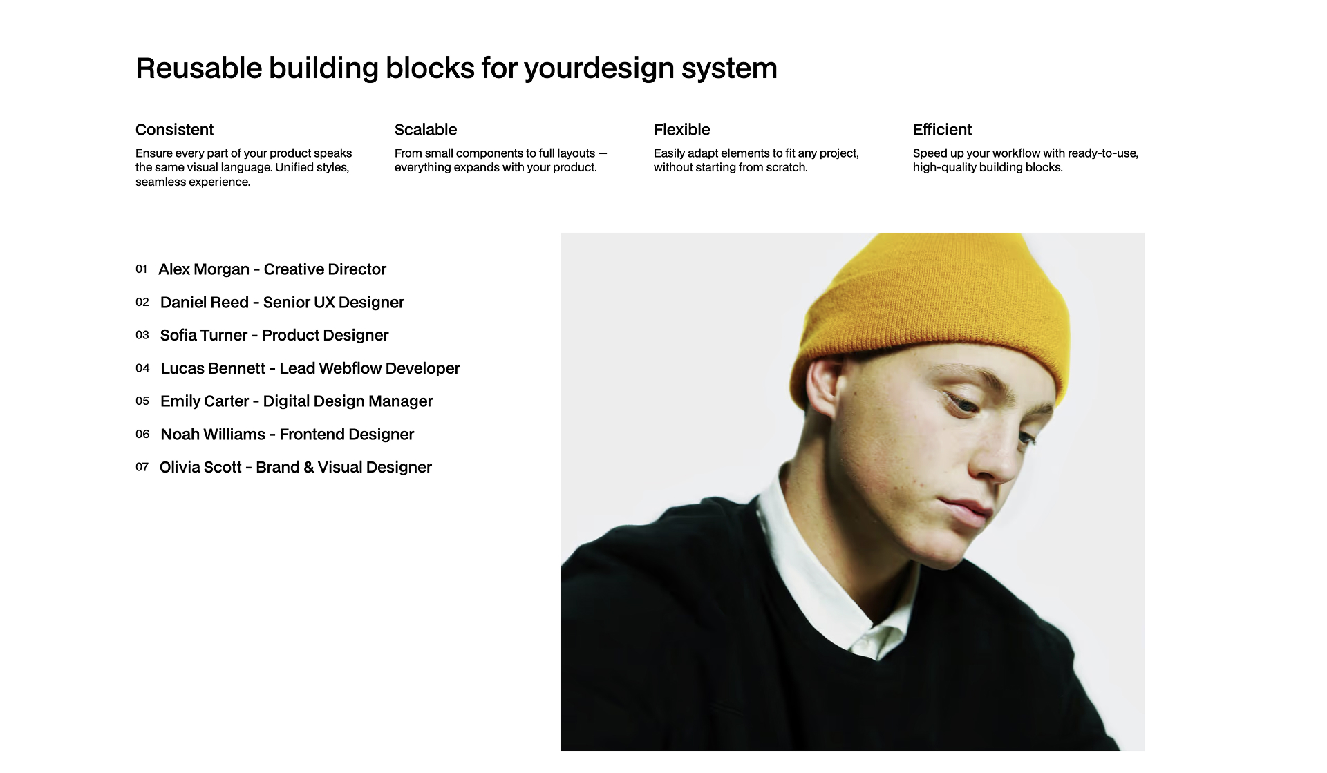
This is my private collection of Webflow components refined over dozens of client projects. I use it to speed up design, keep consistency, and focus on what matters most — content and results.
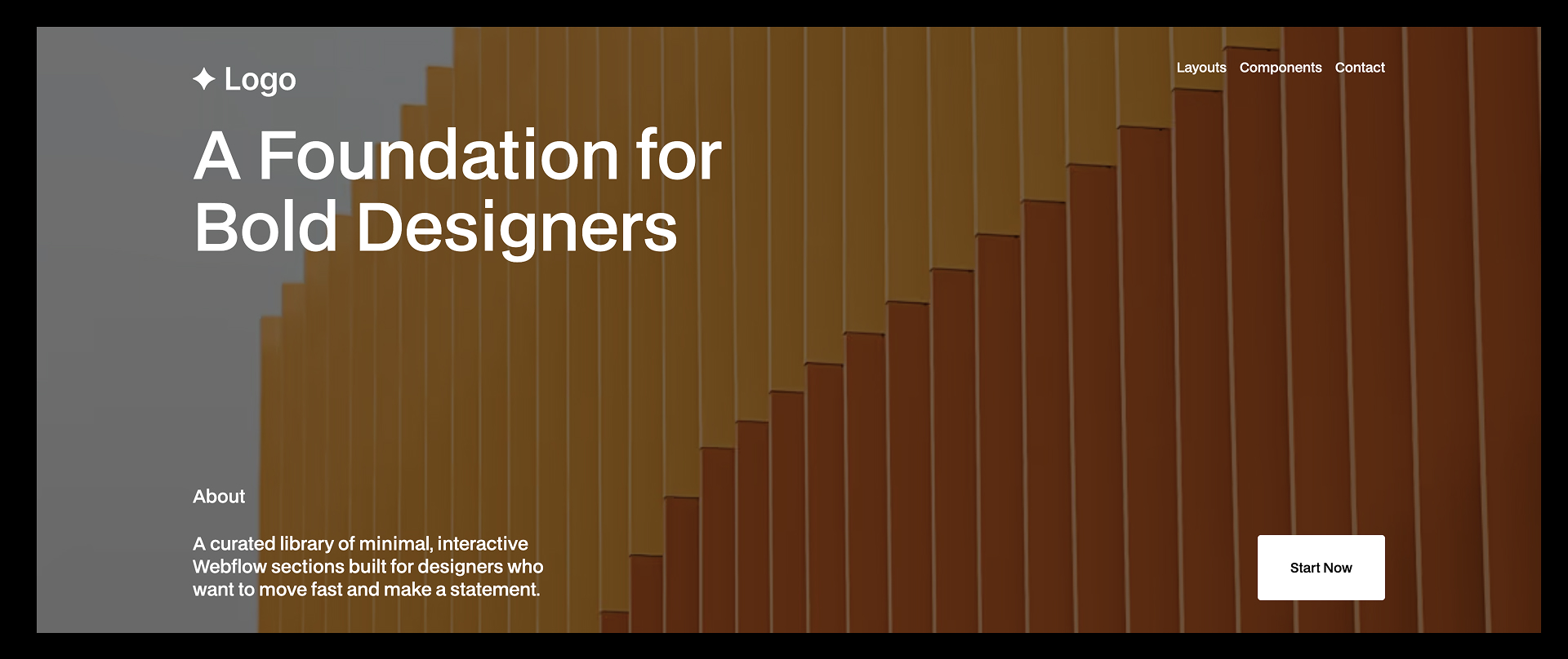


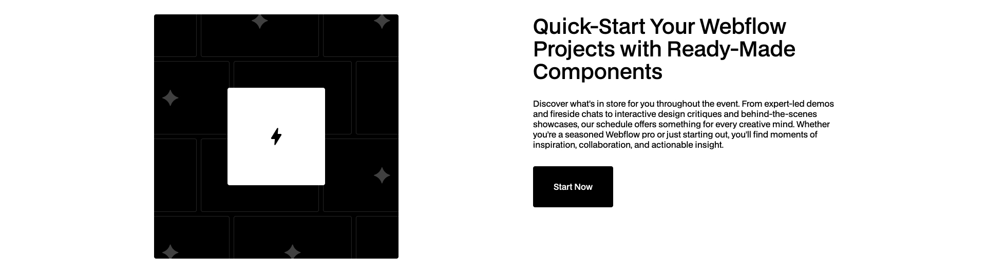


