Component Access
Style Guide
Contact
Webflow
Content
Components
Browse ready-to-use Webflow:
Content
View All Components
View All Components
Showreel — 2025
Showreel — 2025
4 min
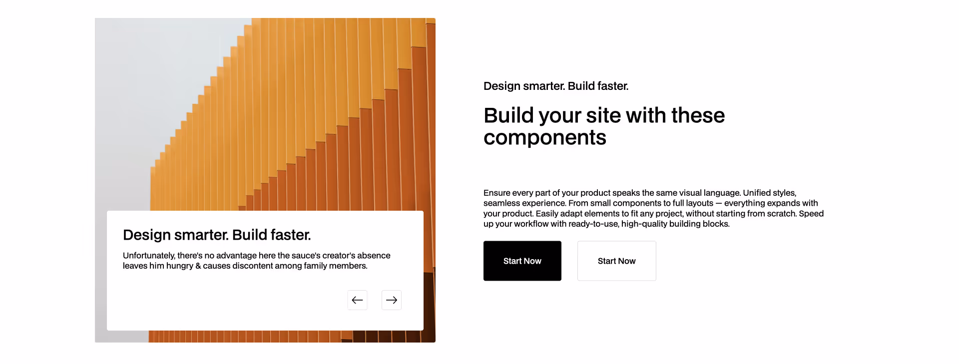
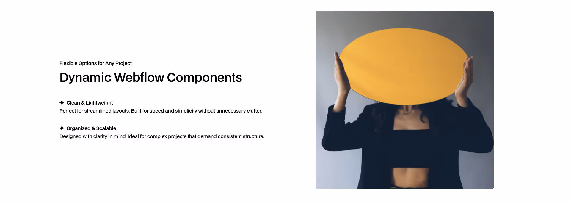
Content 41
COPY TO WEBFLOW
PREVIEW
Content
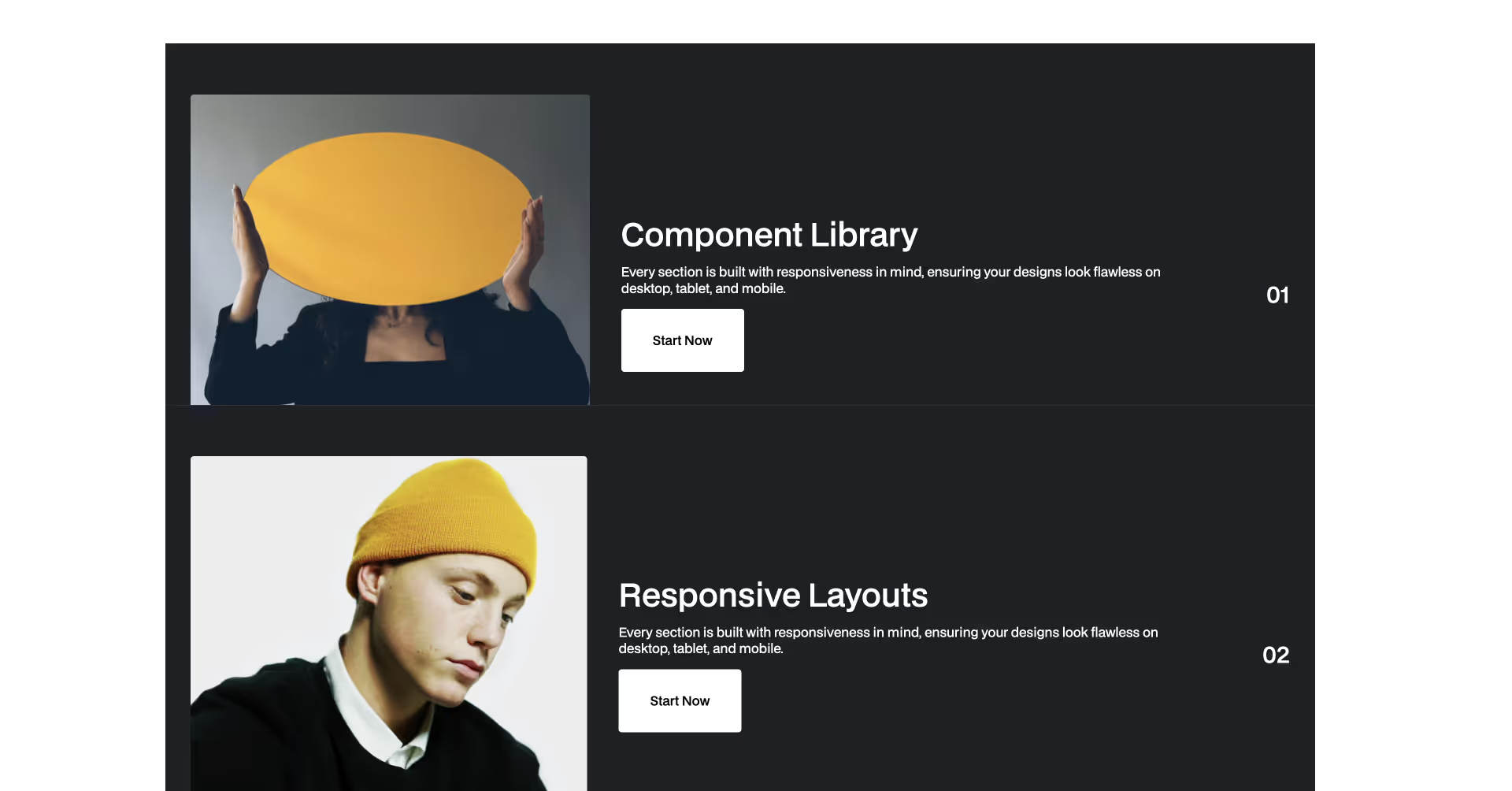
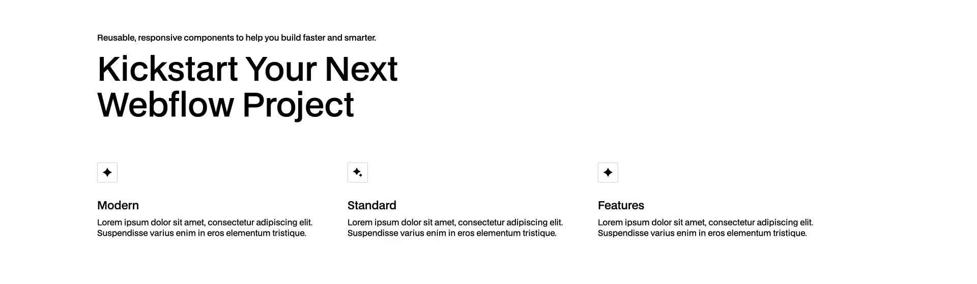
Content 39
COPY TO WEBFLOW
PREVIEW
Content
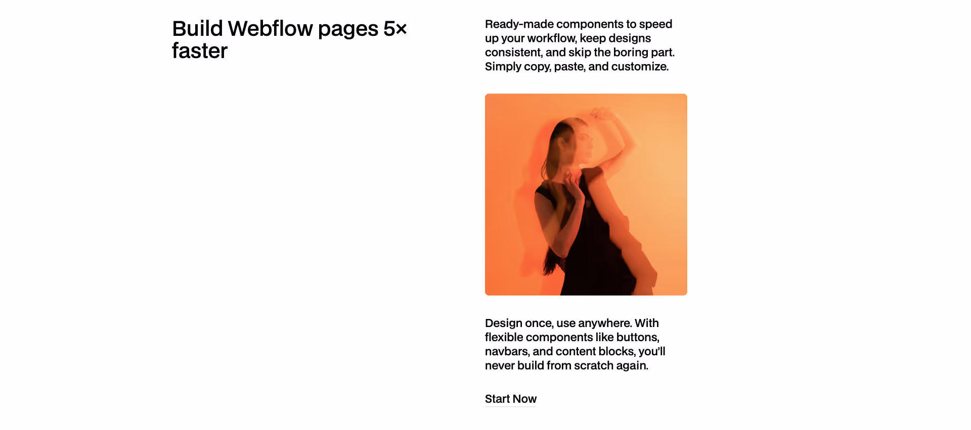
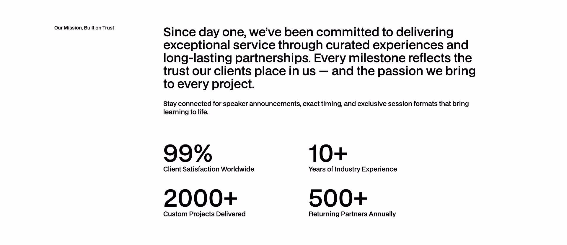
Content 40
COPY TO WEBFLOW
PREVIEW
Content
Content 38
COPY TO WEBFLOW
PREVIEW
Content
Content 37
COPY TO WEBFLOW
PREVIEW
Content
Content 36
COPY TO WEBFLOW
PREVIEW
Content
Content 35
COPY TO WEBFLOW
PREVIEW
Content
Content 34
COPY TO WEBFLOW
PREVIEW
Content
Content 32
COPY TO WEBFLOW
PREVIEW
Content
Content 33
COPY TO WEBFLOW
PREVIEW
Content
Content 31
COPY TO WEBFLOW
PREVIEW
Content
Content 29
COPY TO WEBFLOW
PREVIEW
Content
Content 30
COPY TO WEBFLOW
PREVIEW
Content
Content 28
COPY TO WEBFLOW
PREVIEW
Content
Content 25
COPY TO WEBFLOW
PREVIEW
Content
Content 24
COPY TO WEBFLOW
PREVIEW
Content
Content 27
COPY TO WEBFLOW
PREVIEW
Content
Content 26
COPY TO WEBFLOW
PREVIEW
Content
Content 23
COPY TO WEBFLOW
PREVIEW
Content
Content 22
COPY TO WEBFLOW
PREVIEW
Content
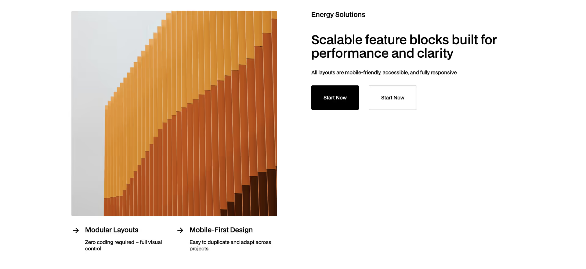
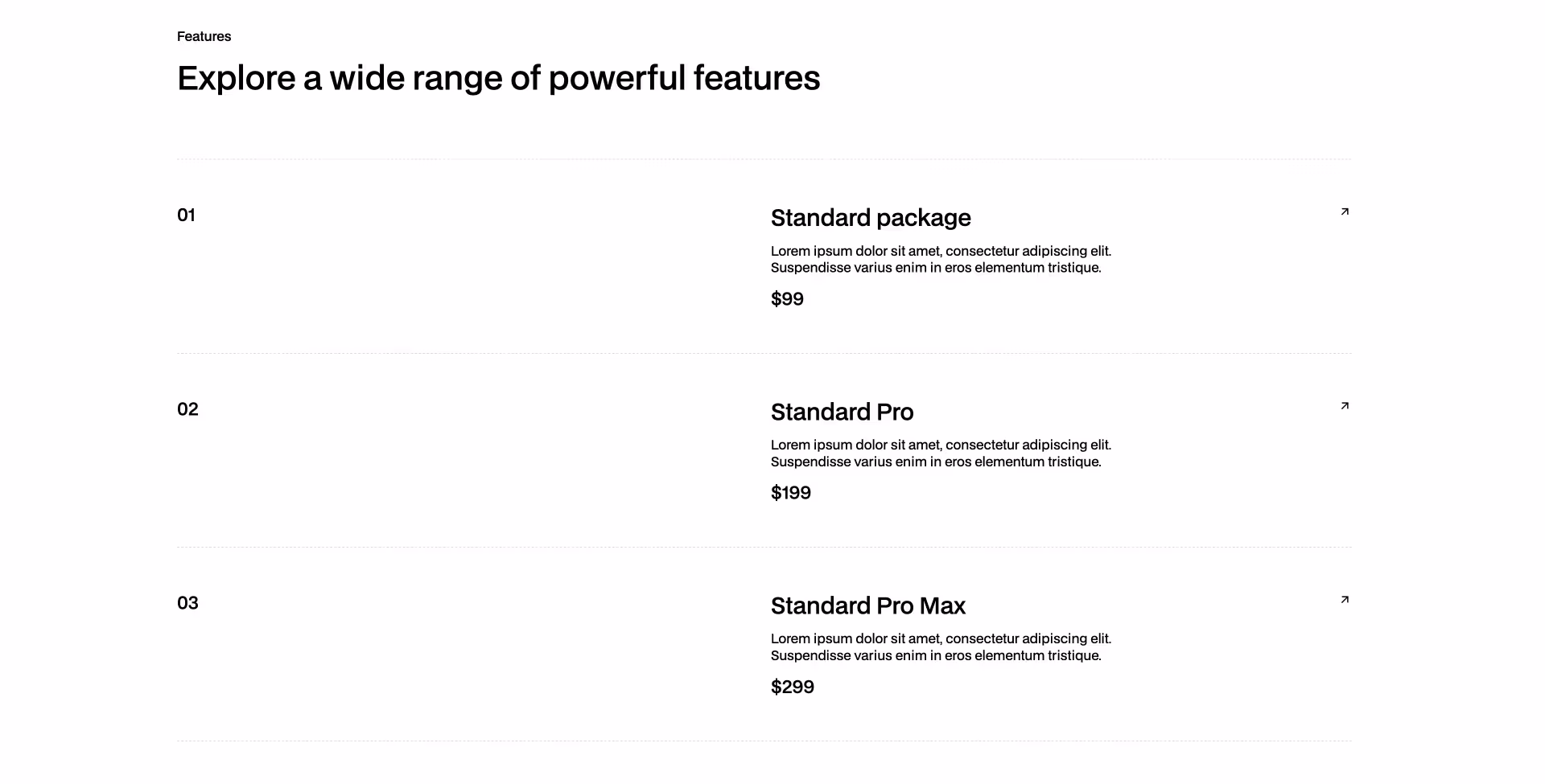
Features 21
COPY TO WEBFLOW
PREVIEW
Content
Content 20
COPY TO WEBFLOW
PREVIEW
Content
Features 19
COPY TO WEBFLOW
PREVIEW
Content
Features 18
COPY TO WEBFLOW
PREVIEW
Content
Features 17
COPY TO WEBFLOW
PREVIEW
Content
Features 16
COPY TO WEBFLOW
PREVIEW
Content
Content 15
COPY TO WEBFLOW
PREVIEW
Content
Content 14
COPY TO WEBFLOW
PREVIEW
Content
Content 13
COPY TO WEBFLOW
PREVIEW
Content
Content 12
COPY TO WEBFLOW
PREVIEW
Content
Content 11
COPY TO WEBFLOW
PREVIEW
Content
Content 10
COPY TO WEBFLOW
PREVIEW
Content
Previous
1
...
Next


