Free Webflow components
Pricing
Component Access
FAQ
Blog
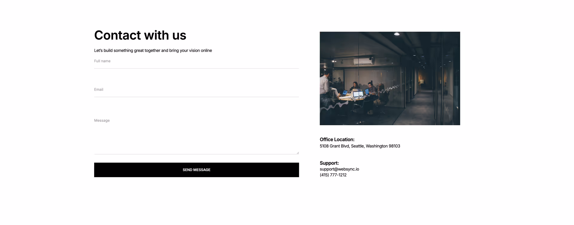
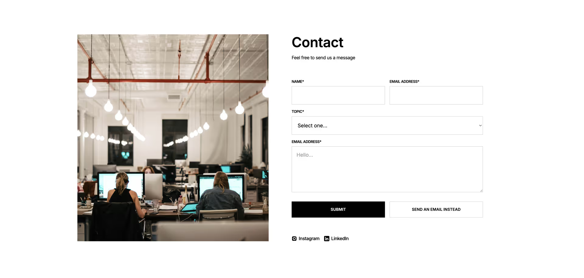
Contact
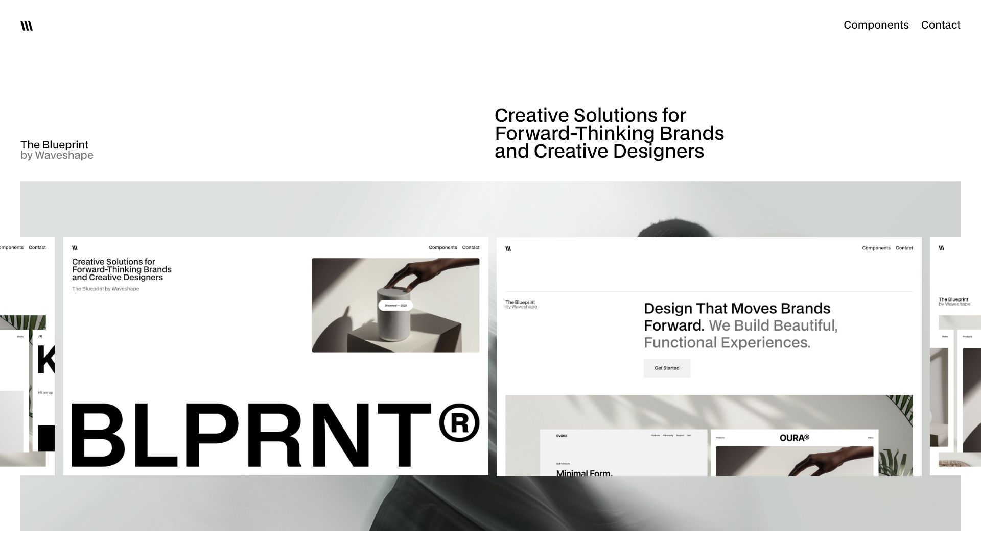
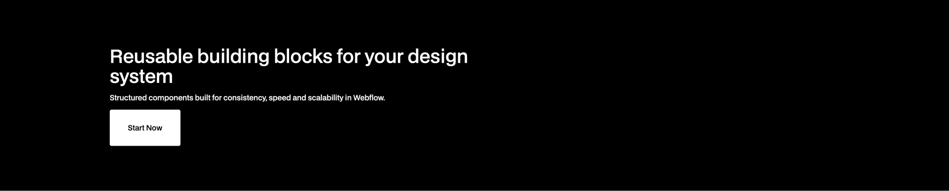
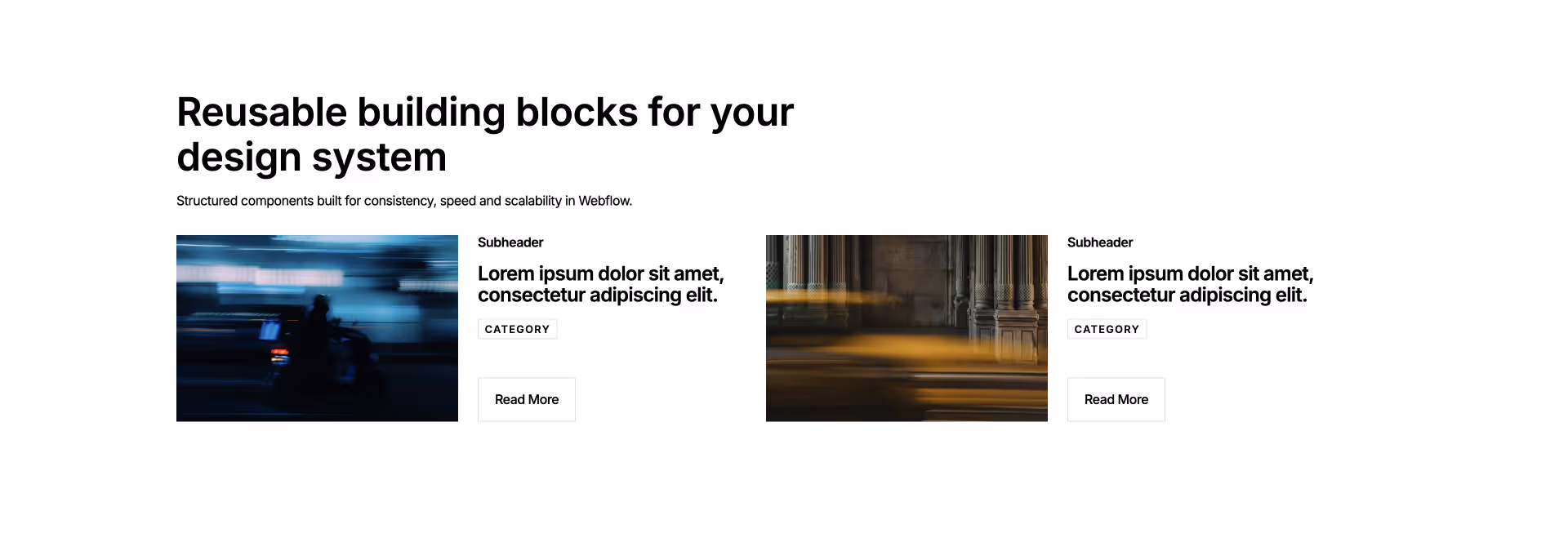
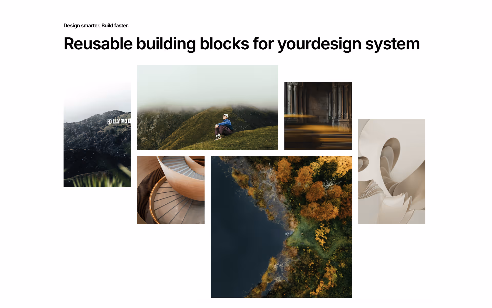
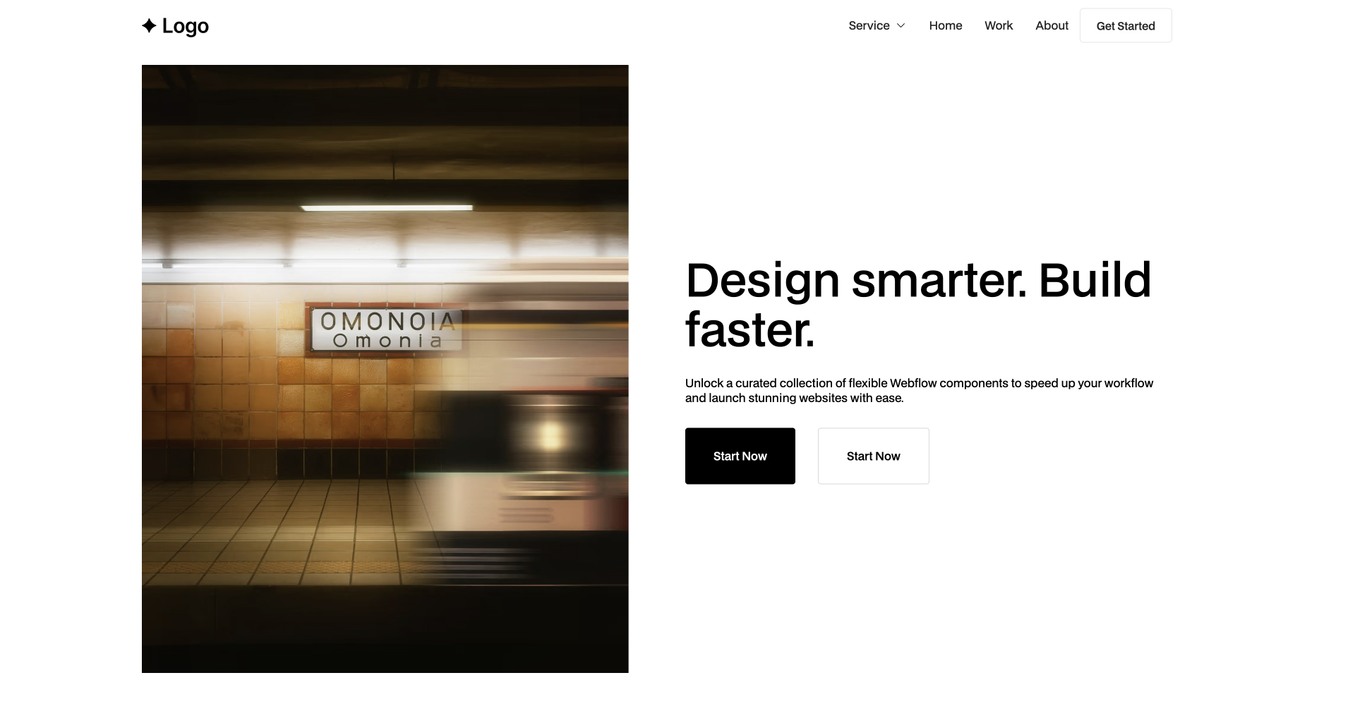
Build Webflow sites faster Impress clients easier
Lifetime access to high-converting UI sections that just work
Buy Lifetime Access for 49$
Buy Lifetime Access for 49$
Clone Style Guide
Showreel — 2025
Showreel — 2025
4 min
More Filters
Component interaction
Featured
Checkbox 8
Blog
0
[
0
]
CTA
0
[
0
]
Card
0
[
0
]
Contact
0
[
0
]
Content
0
[
0
]
Footer
0
[
0
]
Header
0
[
0
]
Hero
0
[
0
]
List
0
[
0
]
Logo
0
[
0
]
Nav
0
[
0
]
Pricing
0
[
0
]
Team
0
[
0
]
Testimonial
0
[
0
]
Title
0
[
0
]
Clear All
Thank you! Your submission has been received!
Oops! Something went wrong while submitting the form.
Results
1
Showing items
1
to
3
of
6
Filtering by:
Tag
Operator
Value
Nav 9
interaction
COPY TO WEBFLOW
PREVIEW
Nav
Team 9
interaction
COPY TO WEBFLOW
PREVIEW
Team
Component interaction
Testimonial 9
interaction
COPY TO WEBFLOW
PREVIEW
Testimonial
Component interaction
Contact 9
interaction
COPY TO WEBFLOW
PREVIEW
Contact
Footer 9
interaction
COPY TO WEBFLOW
PREVIEW
Footer
Header 9
interaction
COPY TO WEBFLOW
PREVIEW
Header
Logo 9
interaction
COPY TO WEBFLOW
PREVIEW
Logo
Component interaction
Title 9
interaction
COPY TO WEBFLOW
PREVIEW
Title
Hero 9
interaction
COPY TO WEBFLOW
PREVIEW
Hero
Card 9
interaction
COPY TO WEBFLOW
PREVIEW
Card
Features 9
interaction
COPY TO WEBFLOW
PREVIEW
Content
Blog 8
interaction
COPY TO WEBFLOW
PREVIEW
Blog
List 8
interaction
COPY TO WEBFLOW
PREVIEW
List
Nav 8
interaction
COPY TO WEBFLOW
PREVIEW
Nav
Cta 8
interaction
COPY TO WEBFLOW
PREVIEW
CTA
Contact 8
interaction
COPY TO WEBFLOW
PREVIEW
Contact
Footer 8
interaction
COPY TO WEBFLOW
PREVIEW
Footer
Header 8
interaction
COPY TO WEBFLOW
PREVIEW
Header
Testimonial 8
interaction
COPY TO WEBFLOW
PREVIEW
Testimonial
Logo 8
interaction
COPY TO WEBFLOW
PREVIEW
Logo
Component interaction
Team 8
interaction
COPY TO WEBFLOW
PREVIEW
Team
Title 8
interaction
COPY TO WEBFLOW
PREVIEW
Title
Card 8
interaction
COPY TO WEBFLOW
PREVIEW
Card
Hero 8
interaction
COPY TO WEBFLOW
PREVIEW
Hero
Features 8
interaction
COPY TO WEBFLOW
PREVIEW
Content
Blog 7
interaction
COPY TO WEBFLOW
PREVIEW
Blog
Nav 7
interaction
COPY TO WEBFLOW
PREVIEW
Nav
Cta 7
interaction
COPY TO WEBFLOW
PREVIEW
CTA
Contact 7
interaction
COPY TO WEBFLOW
PREVIEW
Contact
Footer 7
interaction
COPY TO WEBFLOW
PREVIEW
Footer
Header 7
interaction
COPY TO WEBFLOW
PREVIEW
Header
Testimonial 7
interaction
COPY TO WEBFLOW
PREVIEW
Testimonial
Previous
1
...
Next
There are no available cars matching the current filters.
Reset All


