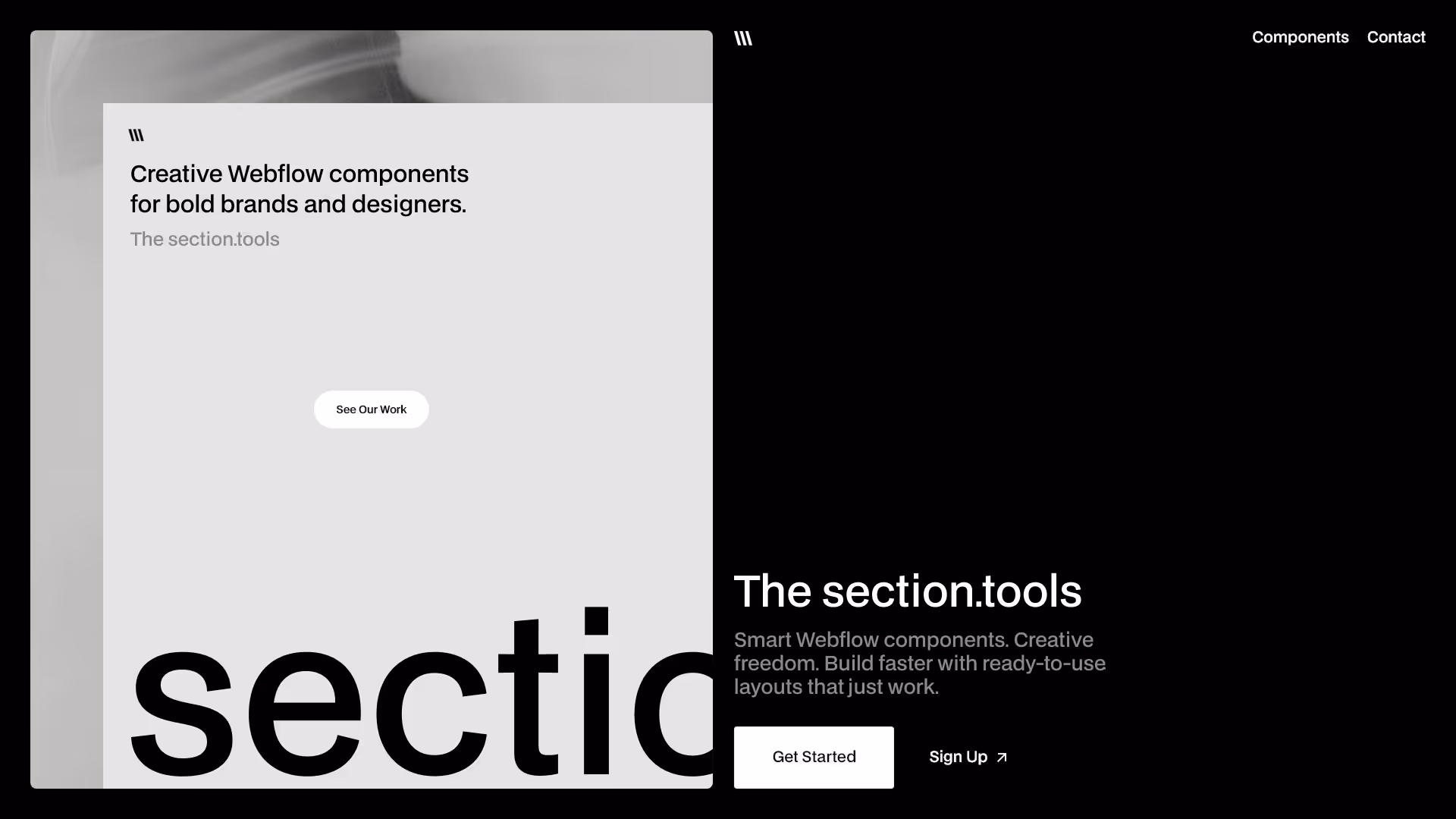
Build Webflow sites faster Impress clients easier

Lifetime access to high-converting UI sections that just work
Showreel — 2025
Showreel — 2025
Play
4 min
Movement
Featured
Clear All
Thank you! Your submission has been received!
Oops! Something went wrong while submitting the form.

Results 1

Showing items 1 to3 of 6

Filtering by:
Tag
Operator
Value
Features 40
interaction
Fullscreen Webflow component with centered hero image icon, headline, description, and CTA on dark background
Content
Card 39
interaction
Statistics section showing animated metrics built with Webflow components
Card
Component interaction
Features 39
interaction
Fullscreen Webflow component with centered hero image icon, headline, description, and CTA on dark background
Content
Card 38
interaction
Webflow component showing a four-step design process
Card
Features 38
interaction
Webflow component with headline, supporting paragraph and call-to-action button arranged in a two-column responsive layout
Content
Card 37
interaction
Webflow component with 6 cards showing user benefits like growth, clarity, and community.
Card
Component interaction
Features 37
interaction
Webflow component with headline, supporting paragraph and call-to-action button arranged in a two-column responsive layout
Content
Card 36
interaction
rótsza wersja:Three black cards with icons and text on reusable Webflow components.
Card
Component interaction
Features 36
interaction
Webflow component with dual image blocks and central content section featuring heading, paragraph and CT
Content
Card 35
interaction
Two dark Webflow cards with image icons, title, and arrow button, highlighting fast and clean UI building
Card
Component interaction
Features 35
interaction
Webflow component with left-aligned image, right-aligned heading, description, and CTA button for responsive feature sections
Content
Card 34
interaction
Three stacked Webflow cards with icon, title, and CTA button on dark, gray, and light backgrounds
Card
Component interaction
Features 34
interaction
Webflow component with left-aligned image, right-aligned heading, description, and CTA button for responsive feature sections
Content
Card 33
interaction
Three-column dark card layout with icons, titles, and short descriptions for Webflow.
Card
Component interaction
Features 33
interaction
Webflow component with large image, right-aligned content block with headline, description, and CTA button for responsive page sections
Content
Card 32
interaction
Webflow component with headline, CTA buttons, and three feature columns on dark background.
Card
Features 32
interaction
Webflow component with headline, description, CTA button, and double image layout for scalable content presentation
Content
List 31
interaction
Six-step layout titled “Build smarter with expert-approved components”, with each step represented by an icon and labeled numerically from 01 to 06, arranged in two horizontal rows with placeholder text “Step content”
List
Card 31
interaction
Webflow component with headline, CTA buttons, and three feature columns on dark background
Card
Features 31
interaction
Responsive Webflow component with dual-image layout and bold headline for design system presentation
Content
List 30
interaction
Six-step layout titled “Build smarter with expert-approved components”, with each step represented by an icon and labeled numerically from 01 to 06, arranged in two horizontal rows with placeholder text “Step content”
List
Card 30
interaction
Webflow component with headline, two CTA buttons, central image placeholder, and four feature descriptions.
Card
Cta 30
interaction
Hero section with bold headline, animated icons, and dual CTA buttons promoting Webflow components
Cta
Contact 30
interaction
Two-location Webflow component with Google Maps embeds for Sydney and New York offices, featuring contact details and “Get Directions” links.
Contact
Features 30
interaction
Webflow component with three image blocks and scalable layout for responsive design systems
Content
List 29
interaction
Four-step Webflow components process showing Planning, Selection, Customization, and Publishing stages with text and icon layout
List
Card 29
interaction
Webflow component with headline, text, two buttons and four feature columns in grid layout.
Card
Cta 29
interaction
Webflow CTA component with tooltip showing contact details and animated icons
Cta
Component interaction
Contact 29
interaction
Three-column locations Webflow component with email, phone, and office details, plus subtle looping “Contact us” text in the background.
Contact
Features 29
interaction
Webflow component with dual image blocks and responsive design layout for modern UI systems
Content
List 28
interaction
Step-by-step Webflow component with numbered process blocks explaining expert-approved website building — including ‘Understand your needs’ and ‘Design the right solution
List
Card 28
interaction
Split layout Webflow component with headline, description, three feature columns, and two CTA buttons.
Card
There are no available cars matching the current filters.
Reset All